In this article I’ll be looking at the three new jerseys for the 2013 NFL season. While Jacksonville officially announced theirs, both the Miami and Minnesota jerseys were leaked in the process via Nike and Uni Watch’s Paul Lukas.
Photo courtesy Nike and Paul Lukas
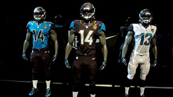
Jacksonville, home
Apparently they are going with an all black home jersey; I am guessing there’s a reason the other two teams that play in Florida didn’t choose black as any of their colors, but whatever.
The teal shoulders don’t look too bad, but there’s no real rhyme or reason to their existence; they don’t appear to have a pattern or anything, so it’s just a random blotch of teal on an otherwise black jersey.
The numbers interlock where appropriate, which is a nice touch. White numbers with gold outline on a black jersey looks sharp.
Solid black collar; perhaps Nike has learned their lesson from the ridiculous “neck rolls”.
Not a big fan of the JAGS patch on the breast; I don’t see why just JAGUARS in script between the NFL logo at the bottom of the collar and the top of the numbers like every other team wouldn’t be sufficient branding.
Black pants, as mentioned above, wtih no apparent trim.
Black top socks, white bottom socks leading to black and teal cleats. This looks a bit ridiculous to me, but NFL rules are NFL rules.
Jacksonville, road
All white. Big minus for me, I am not a fan of all white outfits. Good opportunity to use teal and they choose not to.
Black shoulder splotch, teal numbers with black outline. All white pants, no apparent trim or outlines. Same opinion as the home jerseys.
Jacksonville, alternate
Teal jersey, black shoulder splots, black numbers with white outlines. This looks very sharp, I like it.
Same black pants as the home outfit.
Photo courtesy Nike
Jacksonville, logo
I have no problem with the logo. I actually like it, but I liked the old one as well so it’s really a push.
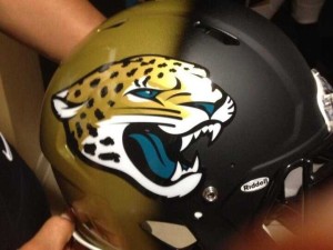
Jacksonville, helmet
Holy shit. What the fuck happened? Going into the reveal the word “gradient” was mentioned quite frequently and it looks like nobody clued in the helmet painter to such a phrase because there’s a very apparent border between the matte black front and the shiny gold rear of this helmet. Considering the black face mask it looks like they started with a solid gold helmet only to have some moron don the helmet and headbutt a can of black spray paint minutes before the unveiling. In a panic, they slapped the logo on and took it public.
I appreciate someone trying something different as much as the next person, but this looks absurd. I suggest you get any helmet-related memorabilia as soon as possible because I honestly don’t see this design lasting past this season.
Overall, once the helmet situation gets rectified, I like the Jaguars’ changes. They look unique without looking overly out of place, which is a tough balancing act (as the helmet undoubtedly shows).
Photo courtesy Nike and Paul Lukas
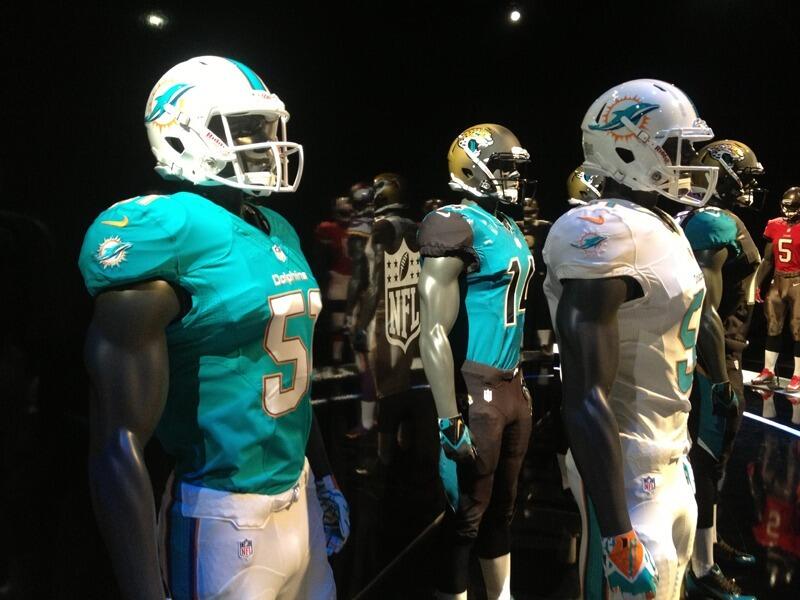
Dolphins, home
Teal jersey, white block numbers with orange outline (they remind me of the Chargers numbering for some reason), white pants with an orange-teal-orange stripe down the side. Dropped the black dropshadow from the numbering for a much cleaner, non-90s look. Eliminated the sleeve striping. Very simple jersey. Too bad they don’t wear it very often (they wore the home teal jersey in all four preseason games, but only two of their 2012 regular season games).
Dolphins, road
All white, same minus as Jacksonville. No sleeve striping. Same pants as the home kit. They dropped the teal collar, eliminating the neck roll effect, thankfully.
The major redesign for the Dolphins centered around the logo. The jerseys didn’t change much at all.
Dolphins, logo
On the helmet, I really like this logo. As a logo on its own, though, I don’t really care for it at all. It fits in context, but I feel as though logos are there as a major icon for a brand, and the new Dolphins logo really doesn’t bring that across for me. Maybe it just needs a helmet?
Dolphins, helmet
Gone is the teal facemask, replaced with white. Very thick teal stripe with thin what looks like darker teal (but is probably orange) striping on the sites. Again, clean look, kept it simple, I approve. Didn’t really care for the teal face masks anyway.
On the whole, not much in the way of changes for the Dolphins, but the three major changes (removal of teal from the facemask and the back of the neck on the road jerseys and the elimination of the numbering drop shadow) I approve of.
Photo courtesy Nike and Paul Lukas
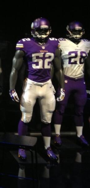
Vikings, home
The piping on the old jerseys ended in a viking horn shape in the back. Never noticed that before. They’re gone now, regardless. Solid purple jersey with a return to one white and one yellow half-stripe on the sleeve. Neck roll double-color removed. Very nice jersey. White numbering with no apparent outline; font is a bit odd but once it’s in motion you won’t notice the subtle custom flair of the numbers and they’re easy to read, which is all I ask for in jersey numbering. White pants, appears to be purple and yellow stripe. Purple cleats look surprisingly good.
Vikings, road
White jersey, same stripe as the home. Neck roll double coloration appears to be gone but no photos from the side/back make it difficult to confirm. Purple numbers, no apparent outline. Purple pants, to my relief, end the run on all-white road kits. No indication if they will run an all-white or all-purple ensemble this year, or if there are any alternate jerseys in the works.
Vikings, logo
Can’t be seen from the photos we have now.
Vikings, helmet
Appears to be a semi-matte purple, with purple facemask. No real changes other than the paint being matte, but it’s a good looking helmet.
FINAL THOUGHTS
The Vikings come out the clear winner (barring a disaster in the logo of cataclysmic proportions that would put the Jaguars helmet to shame) in this year’s jersey roundup. They eliminated every complaint I had about their previous kits without adding any. The Dolphins finish a close second; wearing their home teal more frequently and incorporating the color into their road kit in any meaningful way would’ve helped their case. This means the Jaguars outfits I spent the majority of this article talking about, with such praise as “looking sharp” and “unique” come in dead last. This is the price the designers pay for that helmet. The jersey is great, the pants are fine, the logo is nice, but the helmet is such a disaster that it can’t possibly be ranked over any change of any other team this year.
If the 29 teams not mentioned in this article knew the Jaguars were going to unveil that I have a feeling more than a few would’ve made some changes of their own, safe in the knowledge that even the most vitriolic of feedback would have to be prefaced with “Well it’s certainly better than what the Jags did to their helmet…”.


